Discover how to create effective color palettes using color theory, psychology, and an understanding of branding. Here, you can learn how color influences emotions and brand identity.
Should designers rely only on color selection to succeed? Research from the Pantone Color Institute found that 85% of customers make purchases based on color. In addition, the Color Marketing Group discovered that the right color can increase brand recognition by up to 80%.
Burger King is easy to recognize by its yellow logo, which stimulates consumers’ appetite. Think of Tiffany & Co.’s shade of blue. What do you feel? Exactly — the luxury of that brand.
Every designer knows that color schemes serve visual, emotional, and psychological functions. But what approach should be used when choosing colors for a creative project? Should senior branding specialists rely on color theory, cultural knowledge, or personal intuition when making their decisions?
Here, we show you how to use colors intentionally and put together color palettes that spark creativity, make an impact, and give your designs a distinct personality.
The Importance of Color Harmony in Design and Color Palettes
Color directly influences human behavior. For example, the color red affects heart rate and attention. Fast-food chains like McDonald’s and KFC use hot shades of red to stimulate appetite and encourage customers to make quick decisions.
As early as the 1970s, American studies showed the impact of color on purchasing decisions. Palettes chosen for decorative elements or advertising banners should be visually attractive and instantly recognizable. Do you still remember the golden apple on a black background and the first iPhone that launched in 2007?
Black and gold appear in many luxury brand logos (for example, Rolex and Lamborghini). A soft color palette gives products like Glossier and Fenty Beauty cosmetics a delicate and airy visual language.
Consumers have different responses to specific color combinations when they see them. A person who sees warm colors may feel energized, while cool colors, including blue and green, tend to create a sense of relaxation.
Types of Color Palettes (with Photo Examples)
Every designer asks at least once: “Which colors work best together?” We have prepared several basic approaches for visually harmonious compositions and for strengthening a specific emotional message. The text below explains different types of color palettes that you can use to achieve interesting design results.
Monochromatic – Minimalism, Elegance, Mood
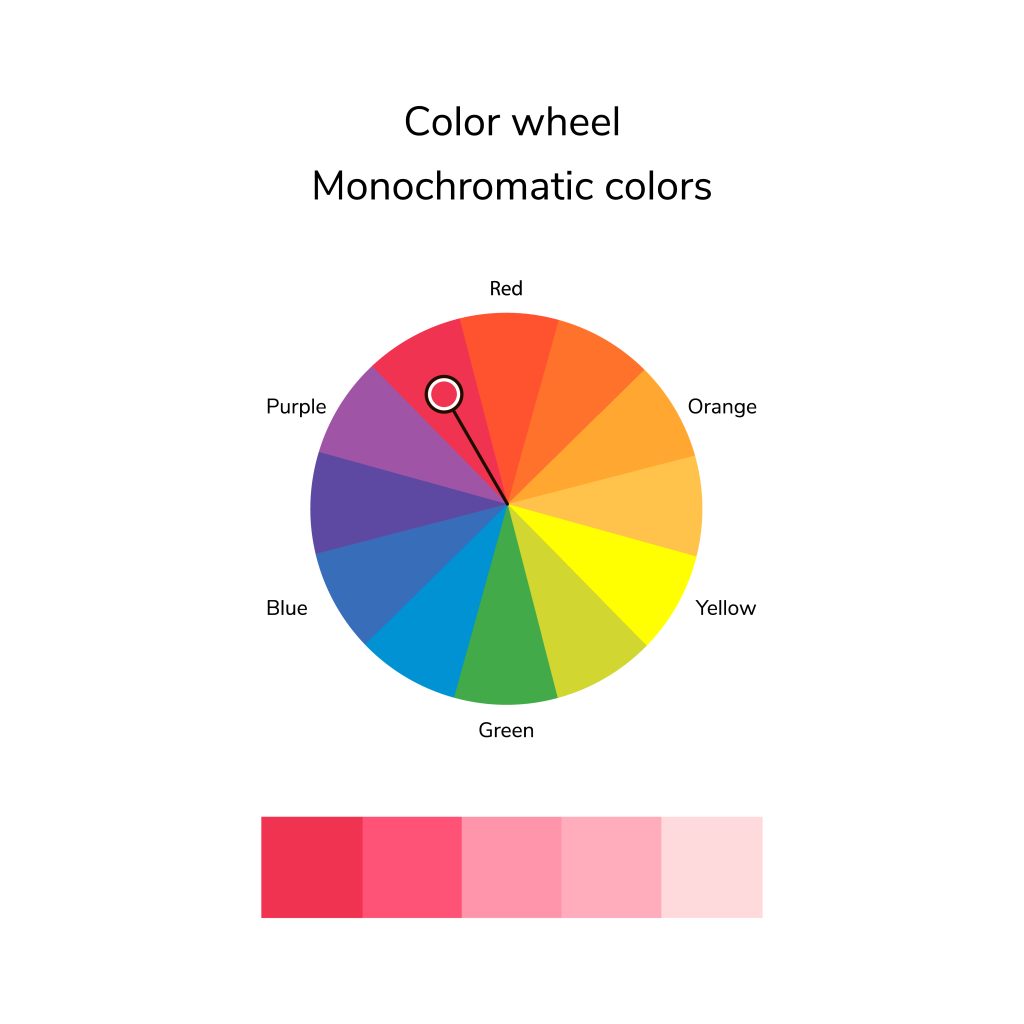
Using multiple tones of one color creates a monochromatic palette. Luxury brands like Chanel and Apple use monochromatic color schemes because they feel minimalist and elegant. The PayPal logo illustrates a monochromatic color scheme with dark and light shades of blue.
Don’t worry if your original image is not perfect. Just start with post-processing. Photo editing is a powerful tool that helps you refine color palettes, balance tones, and improve the overall mood of an image.
Analogous – Natural, Calm Transitions; Ideal for Lifestyle and Landscapes
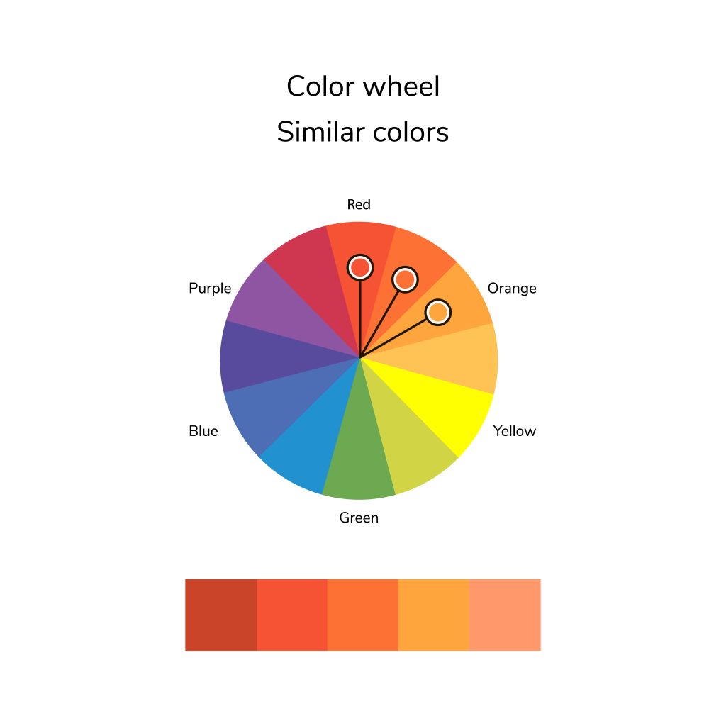
An analogous color palette uses neighboring colors on the spectrum to create balanced schemes. A palette consists of three or more colors with the same core element that naturally transitions from one hue to another. The combinations do not have hard boundaries, so designers use this technique to create a sense of calm, comfort, and natural flow.
Starbucks branding achieves its sense of quality by using several shades. Instagram chose purple, pink, and orange tones to present its bright yet harmonious design.
The soft compatibility of analogous palettes has made them widely used in branding design, UI/UX interfaces, and graphic design.
Complementary – Strong Contrast; Powerful in Portraits and Fashion
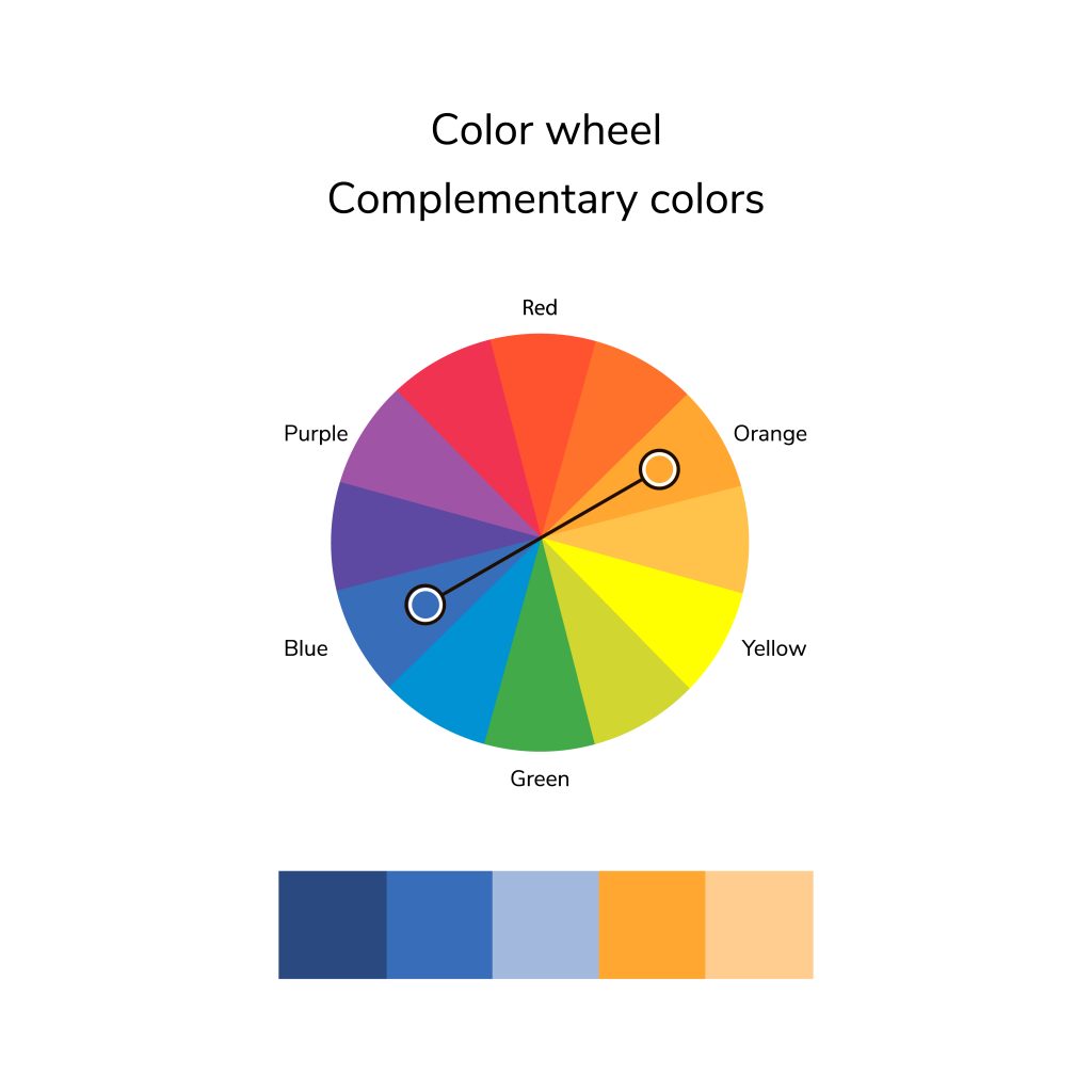
Complementary colors are opposites on the color wheel (such as red and green or blue and orange). This kind of color selection creates a striking and vivid graphic aesthetic that works well in print ads, fashion photoshoots, and artistic work.
Some examples include:
- red and green,
- blue and orange,
- yellow and violet.
In film editing, filmmakers often use the teal-and-orange combination to add more depth to images. This method, which Michael Bay especially loves, gives his cult films Bad Boys and The Island a memorable visual feel. It can be used for more than just films — it all depends on your creativity and skill.
Split-Complementary – Contrast + Complexity
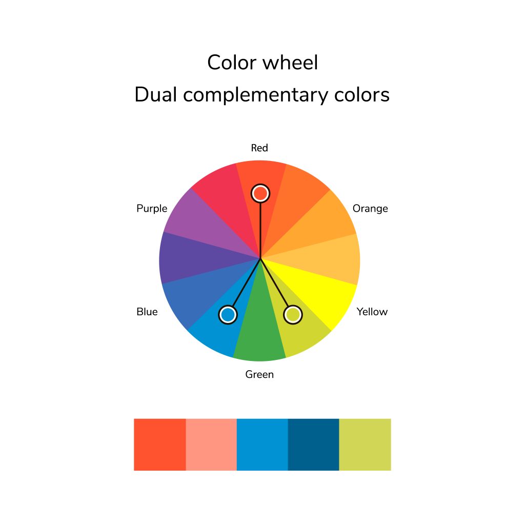
In this color scheme, two warm colors next to a cool color, or vice versa, replace directly opposite color combinations. Although the contrast between the hues remains subtle, it is clearly visible in the films of the Coen brothers: “Burn After Reading,” “Suburbicon,” and “Bad Santa.”
A split-complementary color scheme draws attention to the main components while maintaining visual appeal.
For example, the website of the environmental initiative “Useless London” uses an easily recognizable blue and green scheme to represent its fight against ecological threats.
Triadic – Vibrant, Energetic Compositions
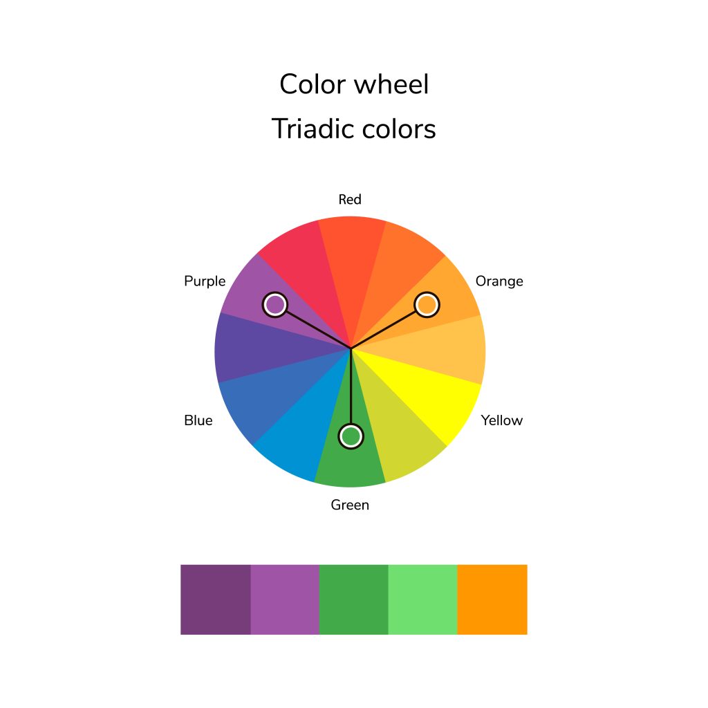
These color schemes are known for bright designs that make a webpage visually engaging. Triadic color schemes such as blue-red-yellow or green-orange-purple are available to web users. Two complementary colors should be used as accents to the primary hue chosen at the beginning of the design process. This is how visual harmony is achieved.
Find color triads by sketching an equilateral triangle on the color wheel. An equilateral triangle drawn on the wheel helps reveal three complementary colors.
Tetradic – Wide Color Variety with Careful Balance
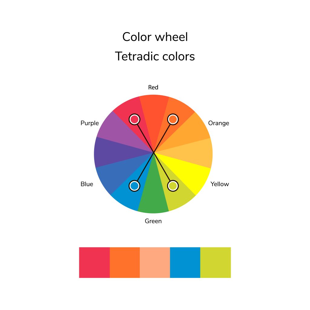
Tetradic schemes, or “square” structures, use four specific colors. At 90-degree intervals, the tones are divided into each of the four sectors of the color wheel. Before adding other combinations such as orange and red-orange, you need to consider the two neighboring hues blue and blue-green. Google is a classic example. It uses red, yellow, green, and blue lettering.
With new technologies, you can improve image quality with AI and carefully build color palettes so they look as vivid and true to life as possible.
Why is this idea so widespread in web design, branding, and graphic design? Just imagine, for example, how our favorite brands can shape your daily life. When you start your device, the Windows emblem sets the tone for the workspace, while Adobe Creative Cloud lets you create an original project. During a break, a smartphone app helps you order a long-awaited item on eBay. Is that enough?
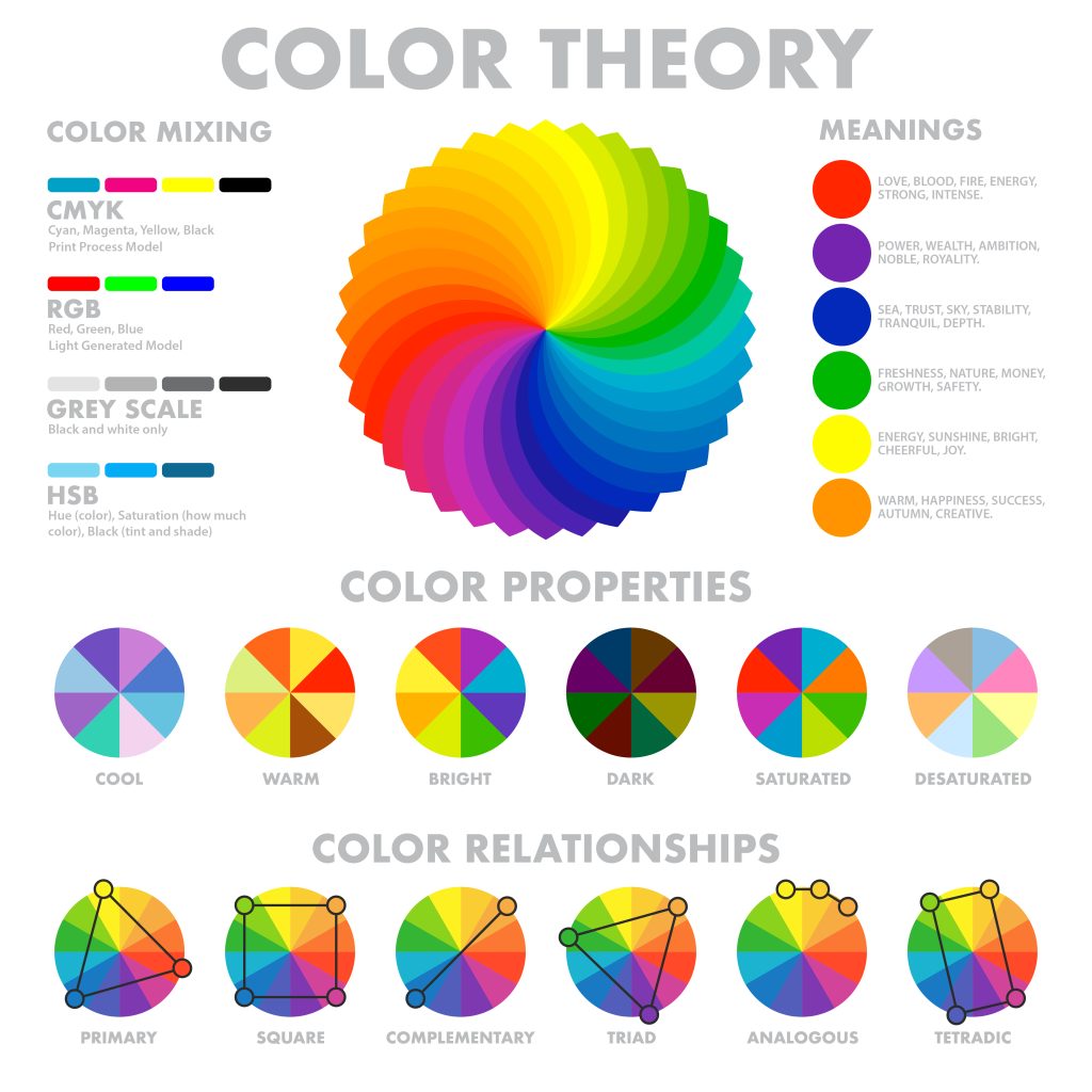
Additive and Subtractive Color Models
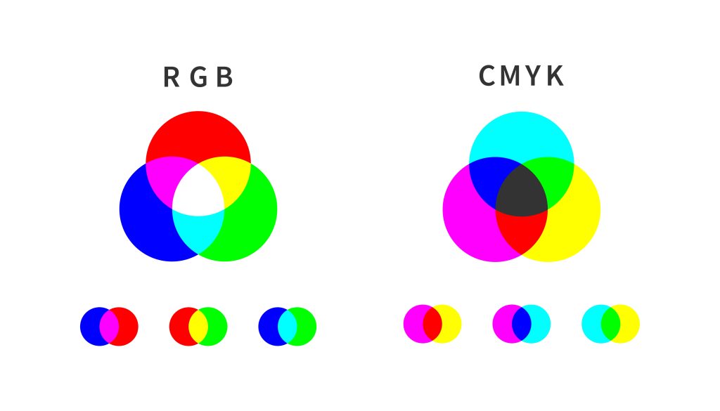
In color theory, there are two basic color models: additive and subtractive systems. These two primary models explain how colors are created and how they change through different manipulations used in digital design, print, and lighting applications.
Even a well-chosen color scheme loses its visual power if images are unclear. That is why it helps to make a photo sharper, to preserve clarity and emphasize color depth.
The Additive Color Model (RGB)
By mixing the primary colors red, green, and blue, the additive color model (RGB) creates new colors. According to this model, the primary colors red, green, and blue combine to produce light, which generates all other shades. If you mix all three at their maximum values, you get white, and if you remove all colors, you get black.
This model is found in all electronic devices, including monitors, televisions, and smartphones. The screen contains tiny light elements that produce red, green, and blue for each pixel. By changing the intensity of screen brightness, users can create different tones.
A solid PC for hobby photographers should have a high-resolution display and strong processing capabilities to handle detailed color adjustments with RAW image files. With the right setup, your colors will appear exactly as you planned them.
The Subtractive Color Model (CMYK)
The CMYK color model (Cyan-Magenta-Yellow-Black) is the standard for print. In CMYK, adding hues results in darker tones, which explains its “subtractive” nature for posters, business cards, and brochures.
In this model, new colors are created by subtracting white light. The final color appears when layers of ink absorb (subtract) certain colors from the white light reflected by the paper surface.
How to Choose a Color Palette for Your Design
 Color selection determines the mood of your design and how its key messages are communicated directly to your target audience. The right color choice for a visual project, including websites, branding elements, and graphics, will improve user engagement with your product while also increasing brand recognition. Let’s look at five steps for choosing a color palette for your project.
- Define what you want to achieve. Your color selection must match your intended message.
- Know your audience. Different groups of people interpret the meaning of colors in different ways. Research the colors that match your audience’s preferences.
- Get inspired. Look to nature, art, fashion, or existing brands. Inspiration is everywhere!
- Use the 60-30-10 rule. Graphic designers can apply the same rule of thumb used in interior design: 60% dominant color, 30% secondary color, and 10% accent color.
- Test and refine. Colors appear differently across various displays and surfaces. Test before making final decisions.
When you adjust your phone camera settings, you get optimal color accuracy straight from the lens. The better your original shot is, the less post-processing you will need.
The Best Tools for Testing and Applying Color Palettes
These applications make it easy to test and confidently edit color palettes. Designers benefit from these tools because they offer color-matching features for palette creation and real-time preview functions, helping refine choices and review visual projects more effectively.
For example, night photography presents a unique challenge, but once mastered, it allows you to experiment with rich, moody color palettes that are impossible to see in daylight. With the right color choices and settings, night shots can become truly unforgettable.
Designers of all skill levels can benefit from technical tools that save time while helping them choose colors that support their creative goals. Here are some excellent options:
- Adobe Color. A great tool for creating and testing color palettes.
- Coolors. Fast and intuitive for finding beautiful color combinations.
- Canva Color Palette Generator. Ideal for beginners and professionals alike.
- Paletton. Helps create more complex color harmonies.
- Google’s Material Design Palette. Useful for web and app designers.
Now you can test and apply color palettes that make it easier to turn your design concepts into reality.
Final Thoughts

Pablo Picasso once said, “The choice of color in art reflects and conveys emotional states, just like facial expression.” And he was right. Artists, filmmakers, writers, designers — they all embed emotional value and hidden meaning into their masterpieces. Colors help create a connection between a brand and its audience.
Think about the impression you want to create. What should people feel when they see your brand? Why should they remember you among thousands of others? Try creating a mood board with colors that inspire you to find your ideal style. Look at what your competitors use. This helps you identify general trends and highlight what makes you unique.
Frequently Asked Questions
How do I choose the right color palette for my design?
Imagine a butterfly scattering Mountain Dew-colored pollen next to the Nike logo. Is that too strange for a sports brand? When developing a concept, practicality, capacity, and clearly defined tones increase the chances that your design will succeed with any audience, including those with impaired color vision.
What are the best tools for creating color palettes?
Some of the best tools include Adobe Color, Coolors, Canva Color Palette Generator, and Paletton. Each offers unique features that help you test and apply colors effectively.
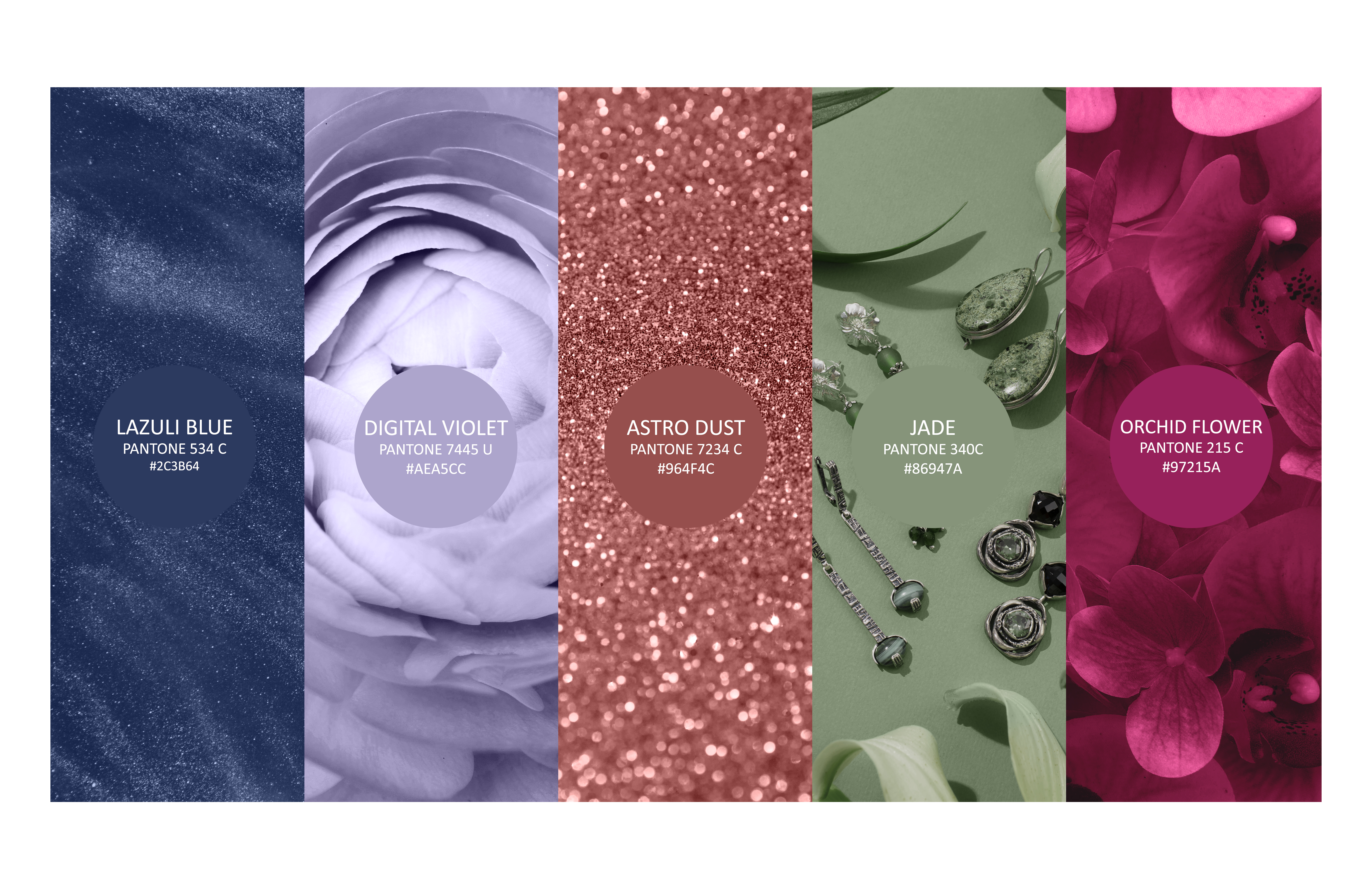
What is the difference between a color palette and a color chart?
In general, a color palette consists of three different groups of primary and secondary colors, while accent colors complete the collection. A color chart is an industry-standardized collection of approved color references used to identify and match colors across different fields.
Color charts used in print shops, graphic studios, and paint businesses provide exact color codes using Pantone and CMYK values, along with other color systems.